A Practical Guide to Exploratory Data Analytics (TA Session)
Before you build a model, write a report, or draw any conclusions from data, you need to actually look at it. This is exactly what EDA is for. In this blog, I will walk through EDA from first principles: what it is, why each technique exists, and the statistical reasoning behind it.
Note: Most examples in the blog will use the Ames Housing dataset, which is a dataset containing real sales records for ~2900 houses in Ames, located in the state of Iowa in the United States.
What is EDA?
EDA is a step in data analytics where we explore, summarize and visualize data to understand its structure, detect patterns, identify anomalies, test assumptions and check relationships between variables before applying any ML/Statistical models.
Formally, EDA is a step in the data analysis pipeline, where you explore, summarize and visualize data to understand its structure, detect patterns, identify anomalies and check relationships between variables, before applying any statistical or ML model. This is important because every statistical model makes assumptions about the data that it is fed (say, assumption that there are no extreme outliers). These assumptions can only be checked with EDA.
What EDA gives you:
- A clear understanding of the dataset
- Reveals patterns between different variables in the data
- Identifies errors and outliers
- Highlights the most important features for making models.
Rule of Thumb: you don't know what you don't know until you plot it. Summary statistics can hide a lot of important information. Two datasets can have identical means, but wildly different shapes.
Take a look at the image below:
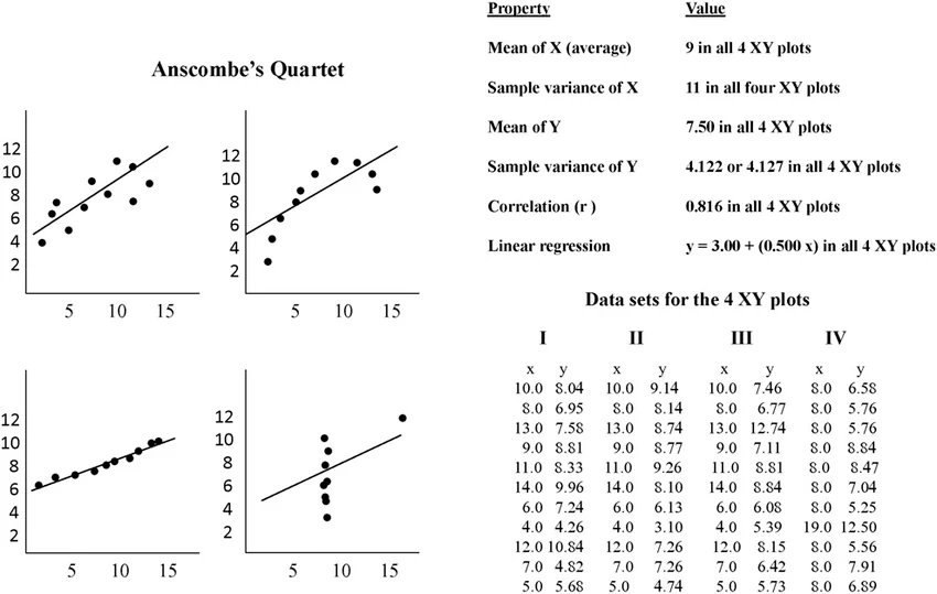 This is called Anscombe's Quartet. It consists of 4 datasets that have the same summary statistics, yet have very different distributions, and appear very different when graphed. This is a good example as to why visualizing your data is important!
Plotly and Plotly Express
Plotly is a popular open-source interactive data visualization library. It is available for Python, R, JavaScript and Julia. Unlike most other visualization tools, Plotly graphs are browser-based. This allows users to actively engage with the data by hovering over data points to see exact values, zooming into specific sections, toggling legends, panning across the graph, etc.
Plotly Express (import px) is a built-in, high-level API for Plotly. It acts as a wrapper around Plotly's lower level graph_objects module. Plotly Express is capable of automatically writing the verbose underlying configuration code while applying sensible, aesthetically pleasing visuals.
Advantages:
- Built to work natively with Pandas dataframes.
- Much simpler than the standard Plotly library.
- Automatic styling
# get started
import plotly.express as px

px.<chart_type>(df, x="col1", y="col2", color="col3")
Univariate Analysis
Looking at one variable at a time. Before comparing anything, it's worth understanding each variable on its own. This is the foundation every chart builds on. Univariate analysis helps us to analyze the distribution of the variable present in the data, so we can perform further analysis.
Summary Statistics
Summary statistics are used to summarize a set of observations, in order to communicate the largest amount of information as simply as possible.
df.describe()
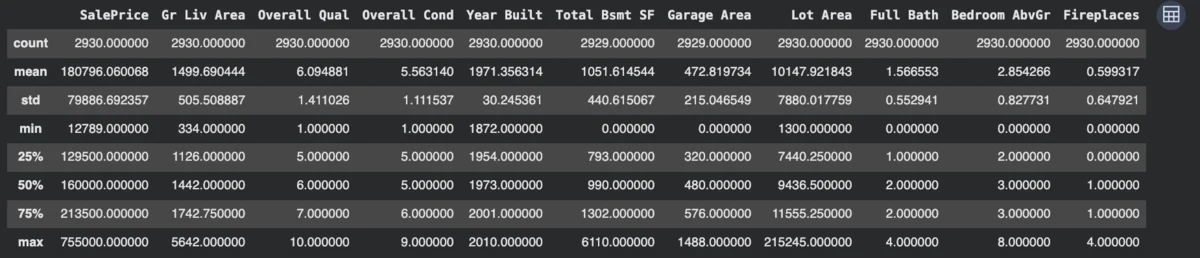
This returns the count, mean, standard deviation, min, max and quartiles for every numeric column. Theoretically, these numbers describe a distribution along 2 axes: central tendency (where the middle of the data is), and dispersion (how spread out the data is around the middle). The gap between mean and median is itself informative. If it is close, the distribution is roughly symmetric. If the mean is higher, the distribution is right skewed, and vice versa.
Bar Chart
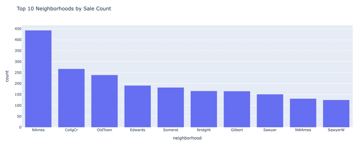
Bar charts are used to show frequency per category. It displays how many observations fall into each discrete category. It is purely a comparison of counts.
top_neighborhoods = (
    df["Neighborhood"]
    .value_counts()
    .head(10)
    .reset_index()
)
top_neighborhoods.columns = ["neighborhood", "count"]

fig = px.bar(
    top_neighborhoods,
    x="neighborhood",
    y="count",
    title="Top 10 Neighborhoods by Sale Count",
)
fig.show()
Histogram
A histogram estimates the probability distribution of a continuous numeric variable by dividing its range into equal-width bins and counting how many observations fall into each one. It's an approximation.
The exact shape you see depends on your choice of bin width (nbins), which is a real statistical tradeoff: too few bins oversmooth the data and hide real structure (like a second peak); too many bins undersmooth it and let random noise masquerade as meaningful pattern.
There is no universally "correct" bin count. It's a judgment call, which is worth explicitly acknowledging rather than treating any single histogram as ground truth.
fig = px.histogram(
    df,
    x="SalePrice",
    nbins=40,
    title="Distribution of Sale Price",
)
fig.show()
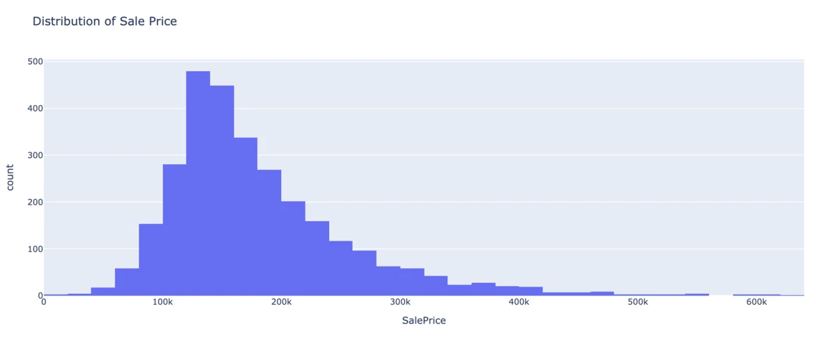
For SalePrice, we can see a right-skewed distribution: most sales cluster in a moderate range, with a long tail of expensive outlier homes stretching to the right.
This is extremely common for price/income/wealth-type variables in the real world. The underlying reason for this is that prices are bounded below by zero but effectively unbounded above, which structurally produces skew rather than symmetry.
Box Plot
A box plot is a five-number visual summary:
- Minimum
- First quartile (Q1)
- Median
- Third quartile (Q3)
- Maximum
The box spans the interquartile range (IQR = Q3 − Q1), representing the middle 50% of the data. The whiskers typically extend to the most extreme point within 1.5 × IQR of the box edges. This approximately captures ~99.3% of a normal distribution, so points beyond it are, under that assumption, unusually rare and get flagged as outliers.
fig = px.box(
    df,
    y="Gr Liv Area",
    points="all",
    title="Above-Ground Living Area Spread",
)
fig.show()
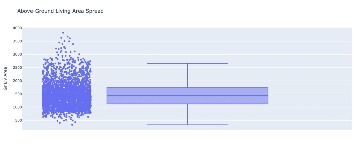
points="all" overlays every individual observation on top of the summary.
Violin Plot
The violin plot's mirrored shape is a kernel density estimate (KDE). It is a smoothed, continuous approximation of the histogram's shape, mirrored left-right for visual symmetry. Where a histogram shows discrete bin counts, a KDE treats the distribution as continuous. It helps make it more informative than a box plot alone. Two datasets can have identical quartiles, while having entirely different distribution shapes, which is only revealed by the violin plot.
fig = px.violin(
    df,
    y="Overall Qual",
    box=True,
    points="all",
    title="Distribution Shape of Overall Quality Rating",
)
fig.show()
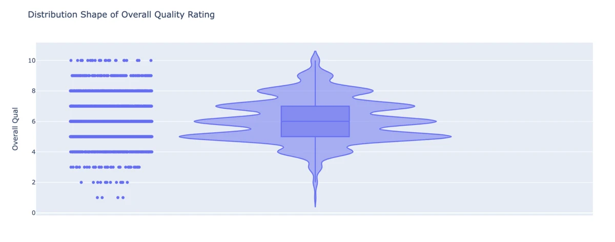
Overall Qual is rated on a discrete 1-10 scale, so the "smoothed" shape will actually show distinct bulges at each integer rather than one continuous curve.
KDE smoothing is an approximation technique, and it behaves differently on discrete data than on genuinely continuous data like SalePrice.
Bivariate Analysis
Once each variable is understood individually, the natural theoretical question becomes: do any 2 variables move together, and if so, how strongly, and in what direction? This is the foundation of correlation and predictive modelling.
Scatter Plot
A scatter plot plots every observation as a point in two-dimensional space, one axis per variable. It's the most direct visual test of a relationship between two continuous variables: patterns that would be invisible in two separate histograms (a linear trend, a curve, clusters, or the complete absence of a relationship) become immediately visible once both variables are plotted together.
fig = px.scatter(
    df,
    x="Gr Liv Area",
    y="SalePrice",
    color="Overall Qual",
    trendline="ols",
    opacity=0.6,
    hover_data=["Neighborhood"],
    title="Living Area vs Sale Price",
)
fig.show()
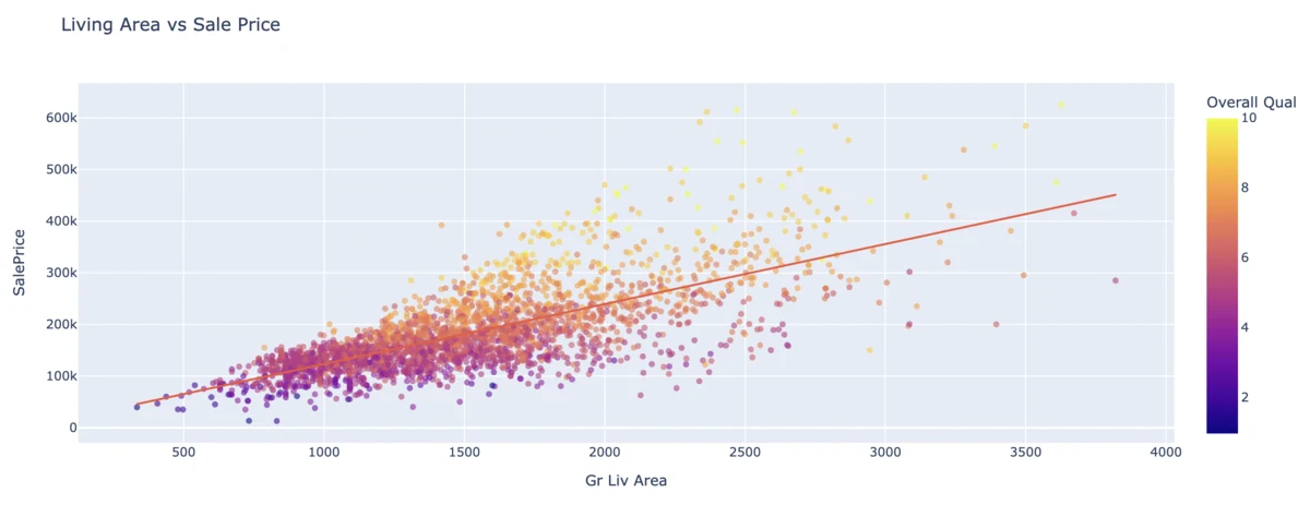
trendline="ols" fits an Ordinary Least Squares regression line (the straight line that minimizes the sum of squared vertical distances between itself and every point).
OLS assumes the true relationship is approximately linear and that the scatter of points around the line (the "residuals") has roughly constant variance across the whole range.
If the scatter visibly fans out wider at higher living areas (a pattern called heteroscedasticity, it is a signal that a simple linear model may not fit well at the extremes).
Coloring by Overall Qual adds a third dimension to a fundamentally two-dimensional chart type.
Line Chart
A line chart is built visualizing how a quantity changes across an ordered sequence (usually time). The key theoretical distinction from a scatter plot is that a line chart implies continuity and order: connecting points with a line visually asserts that intermediate values matter and that the x-axis has a natural sequence, which is only meaningful when that's actually true of your data.
year_price = (
    df.groupby("Year Built")["SalePrice"]
    .mean()
    .reset_index()
)

fig = px.line(
    year_price,
    x="Year Built",
    y="SalePrice",
    title="Avg Sale Price by Year Built",
)
fig.show()
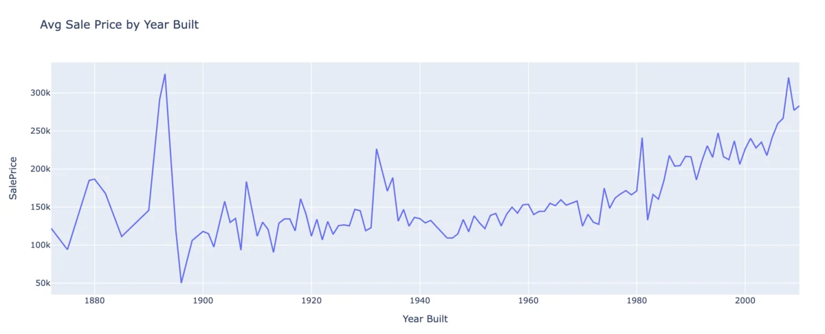
Note the groupby("Year Built").mean() step: this is necessary because many houses share the same build year, and plotting every individual sale against year would just be a scatter plot, too noisy to reveal a trend.
Aggregating to a mean per year is itself a modeling choice: it answers "what's the typical price for a house built in year X," while discarding the spread of prices within that year.
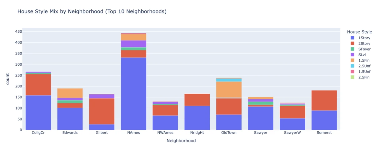
Grouped Bar Chart
This extends the univariate bar chart's frequency-counting logic into two categorical dimensions at once. The choice between barmode="stack" and barmode="group" is a real theoretical distinction, not just a style preference:
- Stacking emphasizes total volume per primary category (each bar's height is the sum across the second category)
- Grouping emphasizes direct comparison between subcategories (each bar stands alone, easier to compare precisely against its neighbors). Stacked bars are better for "how big is this category overall," grouped bars are better for "which subcategory wins within this category."
top_n_list = top_neighborhoods["neighborhood"].tolist()

style_neighborhood = (
    df[df["Neighborhood"].isin(top_n_list)]
    .groupby(["Neighborhood", "House Style"])
    .size()
    .reset_index(name="count")
)

fig = px.bar(
    style_neighborhood,
    x="Neighborhood",
    y="count",
    color="House Style",
    barmode="stack",
    title="House Style Mix by Neighborhood "
          "(Top 10 Neighborhoods)",
)
fig.show()
Box Plot per Category
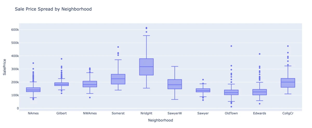
This repeats the single-variable box plot once per category, turning a summary of one distribution into a comparison of several. This is where box plots earn their keep over a simple bar chart of averages.
fig = px.box(
    df[df["Neighborhood"].isin(top_n_list)],
    x="Neighborhood",
    y="SalePrice",
    title="Sale Price Spread by Neighborhood",
)
fig.show()
 ---
---
Multivariate Analysis
Multiple variables in a single view.
Real-world outcomes are rarely explained by a single variable. In our case, a house's price is not just a function of its size. It also depends on the quality, age, location, etc., all of which interact simultaneously. Multivariate techniques exist because some patterns only become visible once several variables are considered together.
Bubble Scatter Plot
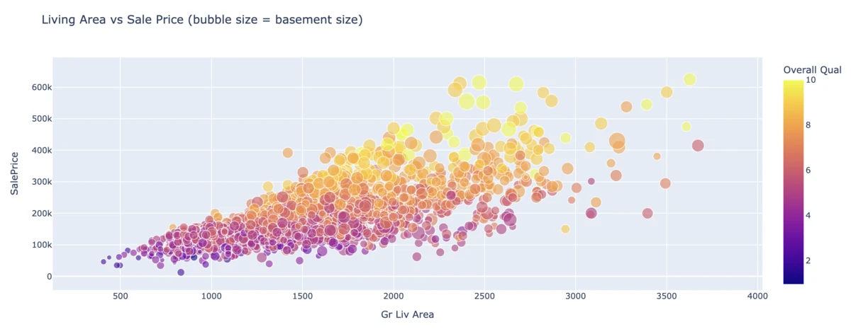
A bubble chart is a scatter plot with an additional variable encoded via marker size. Position (x, y), color, and size can each independently carry information, so a single 2D chart can actually represent three or four variables at once without becoming an unreadable table.
df["Total Bsmt SF"] = df["Total Bsmt SF"].fillna(0)

fig = px.scatter(
    df,
    x="Gr Liv Area",
    y="SalePrice",
    size="Total Bsmt SF",
    color="Overall Qual",
    hover_data=["Neighborhood"],
    opacity=0.6,
    size_max=25,
    title="Living Area vs Sale Price "
          "(bubble size = basement size)",
)
fig.show()
Scatter Matrix
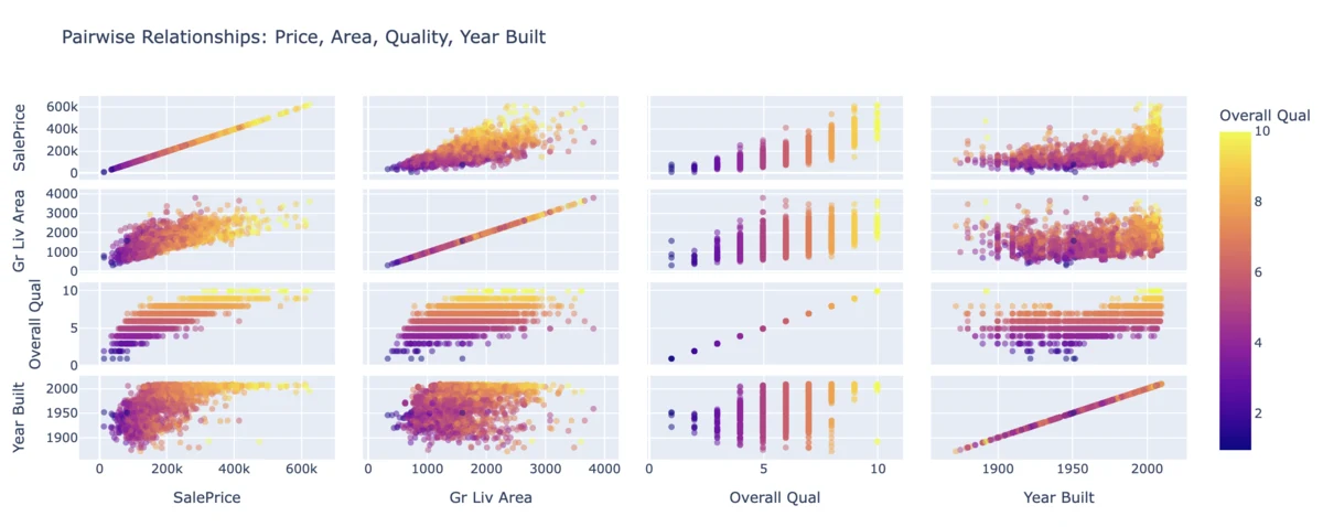
A scatter matrix builds every pairwise scatter plot among a set of variables simultaneously, arranged in a grid. It exists specifically to address the blind spot of a correlation heatmap. Since it shows you the actual shape of every relationship, not just a single summary number, you can visually confirm whether a high correlation genuinely reflects a clean linear pattern or is being distorted by an outlier or a nonlinear trend.
fig = px.scatter_matrix(
    df,
    dimensions=[
        "SalePrice",
        "Gr Liv Area",
        "Overall Qual",
        "Year Built",
    ],
    color="Overall Qual",
    opacity=0.5,
    title="Pairwise Relationships: Price, Area, "
          "Quality, Year Built",
)
fig.show()
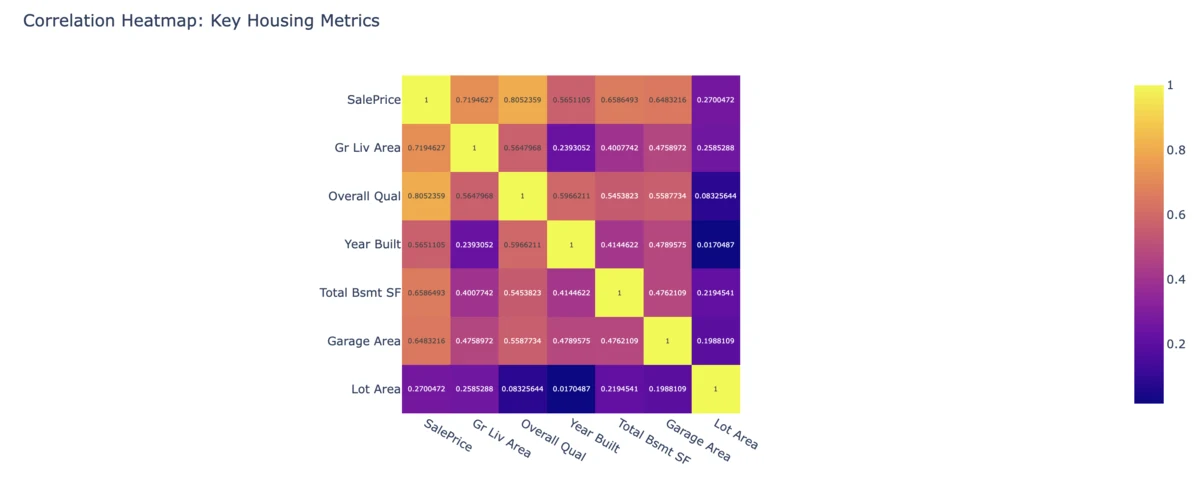
Correlation Matrix
Correlation (specifically, Pearson's r, which is what .corr() computes by default) quantifies the strength and direction of a linear relationship between two numeric variables, on a scale from -1 (perfect negative relationship) to +1 (perfect positive relationship), with 0 indicating no linear relationship.
A heatmap of a correlation matrix lets you scan every pairwise combination of numeric variables at once, rather than building a full scatter matrix and eyeballing each panel.
num_cols = [
    "SalePrice",
    "Gr Liv Area",
    "Overall Qual",
    "Year Built",
    "Total Bsmt SF",
    "Garage Area",
    "Lot Area",
]

fig = px.imshow(
    df[num_cols].corr(),
    text_auto=True,
    title="Correlation Heatmap: Key Housing Metrics",
)
fig.show()
That's about it for this blog. See you in the next one!